
01
Brand identity
A recognisable brand
Logo, typography and colour combine into a recognisable, professional identity.

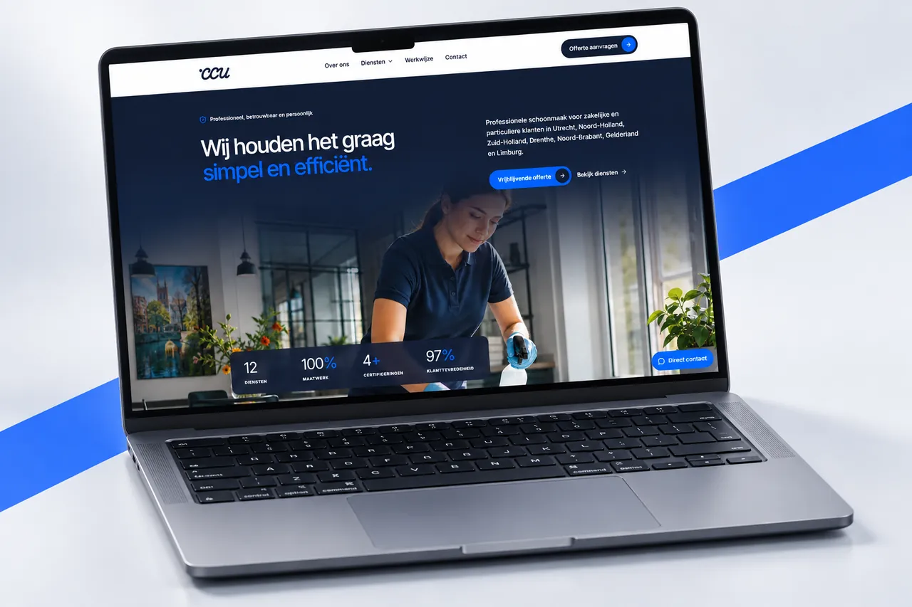
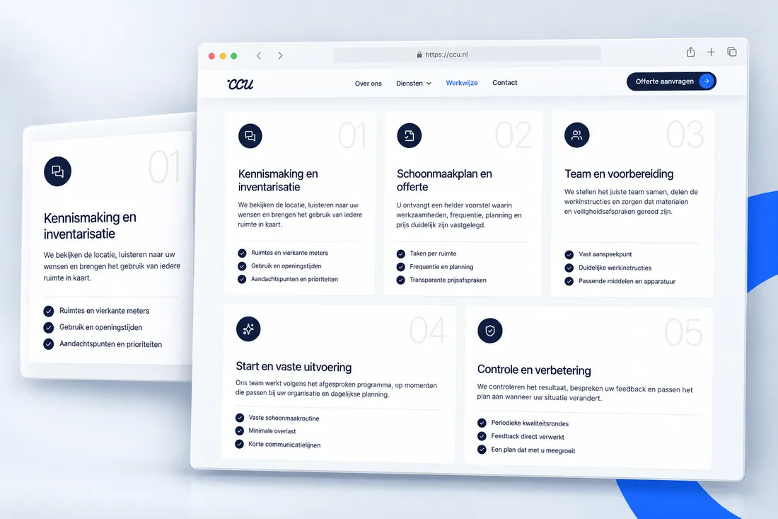
Cleaning Center Utrecht provides cleaning services for businesses and private customers. We developed the branding and built a new website that clearly brings services, coverage and quote requests together.
The challenge
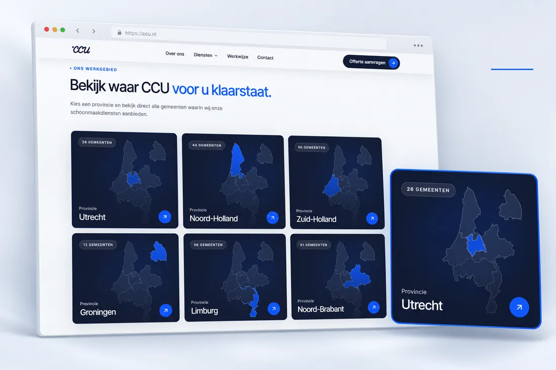
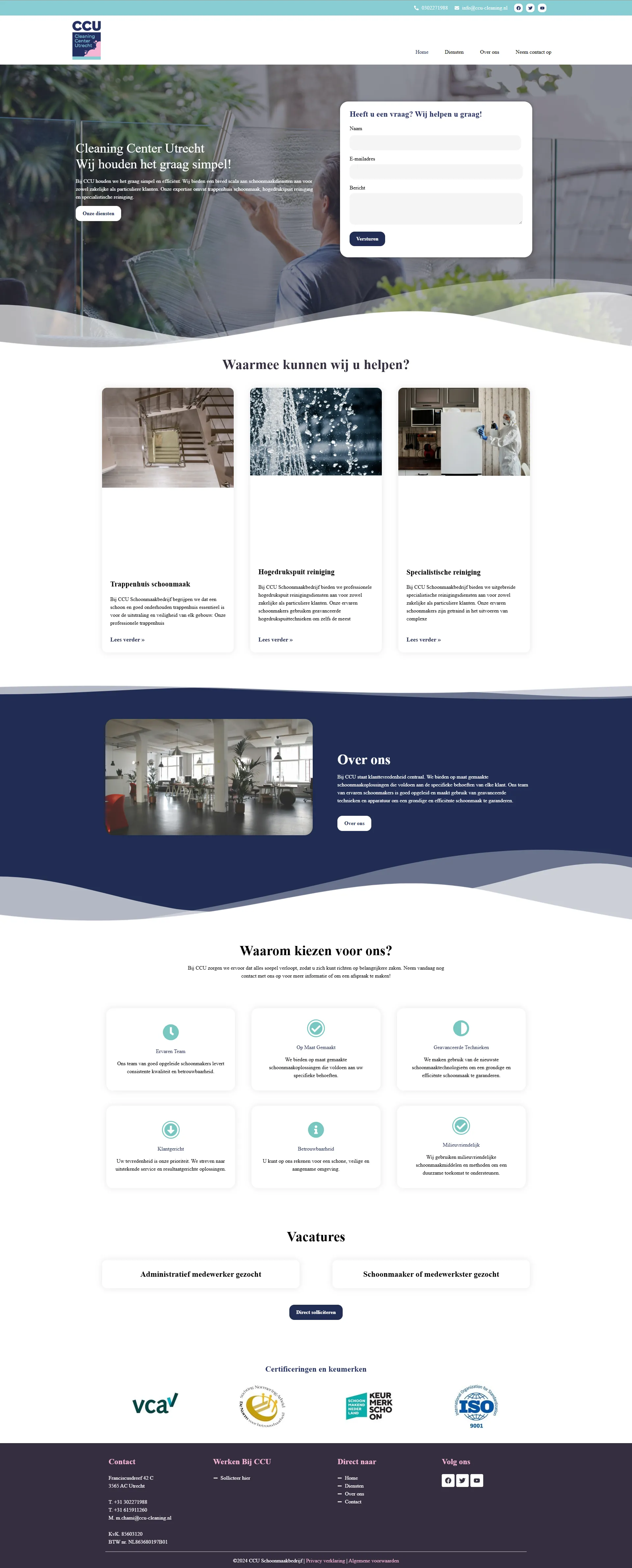
The previous website didn’t make it immediately clear which services CCU offers or where it operates. The route to a suitable quote was unclear too, making CCU’s experience and professionalism harder to see.
Our approach
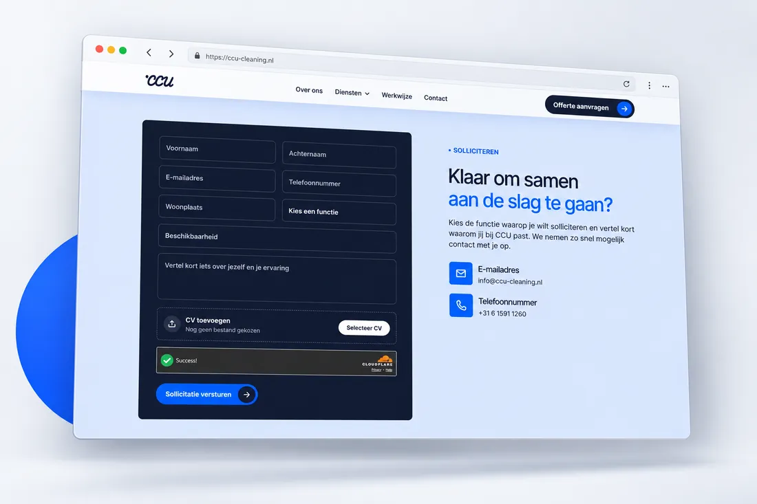
We translated CCU’s services into a recognisable visual identity, clear information architecture and a quote flow that collects the right details.
Brand identity
Logo, typography and colour combine into a recognisable, professional identity.
UX & structure
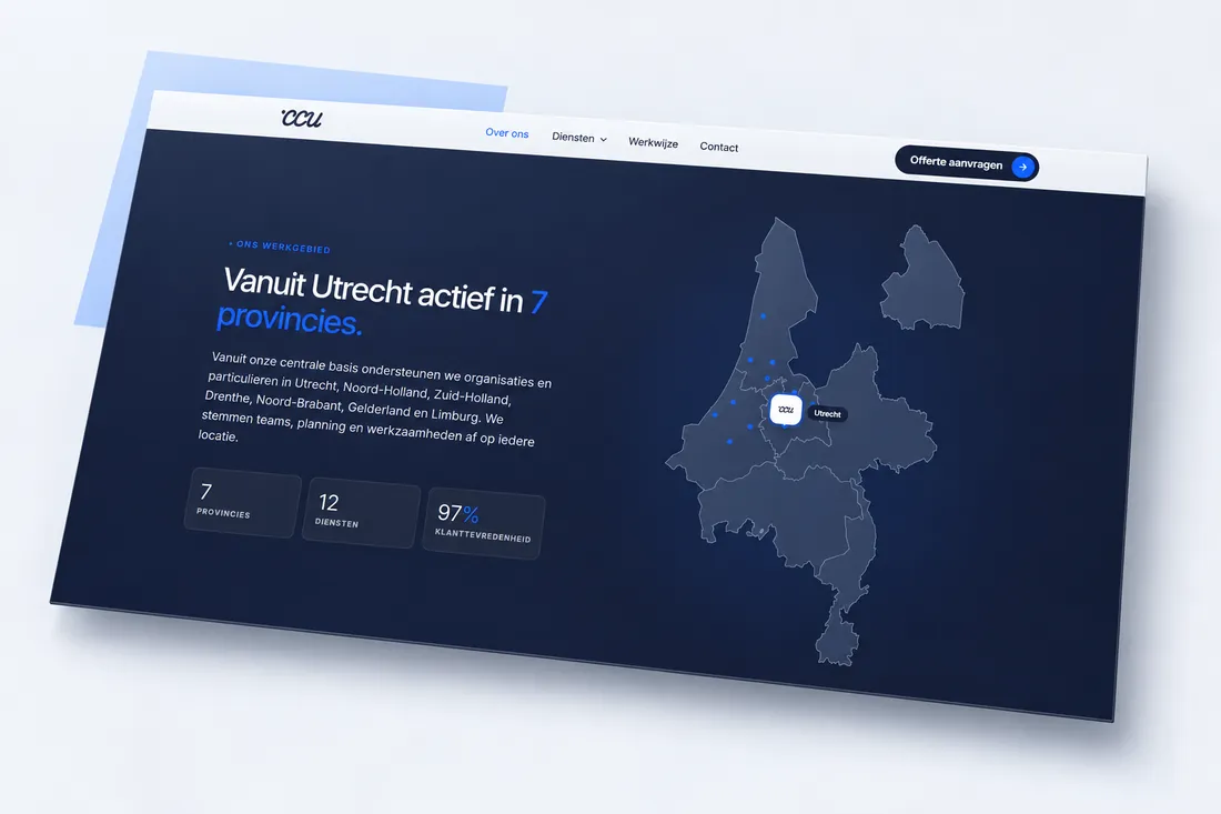
Services are grouped clearly, with regions and municipalities mapped at a glance.
Conversion flow
Visible contact prompts lead to a form for service, frequency and requirements.
The result
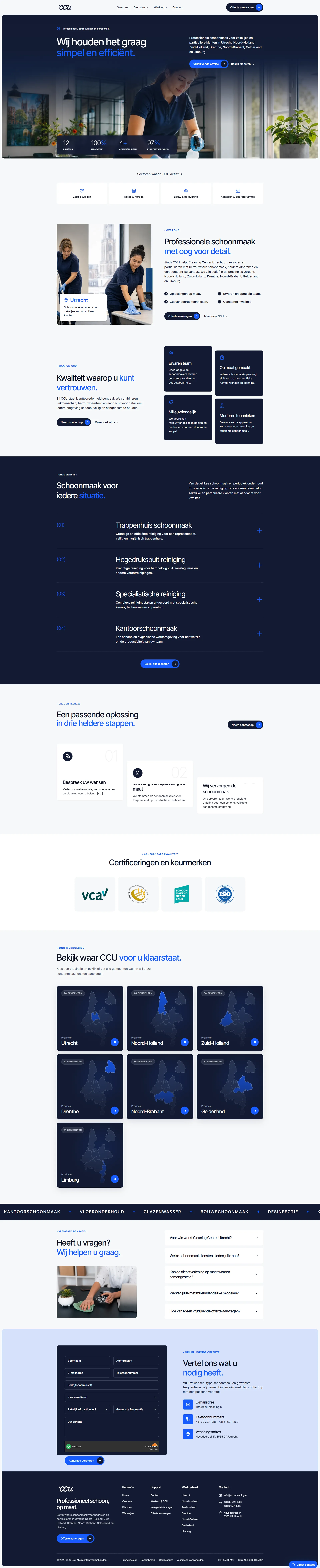
The refreshed identity and website make CCU’s offer clear and give visitors a straightforward path from discovery to quote request.
Brand
01A recognisable identity
Website
02A clear digital presentation
Service area
03Service regions clearly presented
Quotes
04A focused route to contact
Before & after
Free introductory call
In 20–30 minutes, we look at your brand, website or online store, and campaigns. We discuss what works, where the opportunities are, and which step could make the biggest difference now.
Initial insights
Focused discussion
Practical advice
Clear approach
No obligation. You decide what to do with the advice.

You'll speak with Basma
Senior consultant+31 30 340 3996
Explore more cases